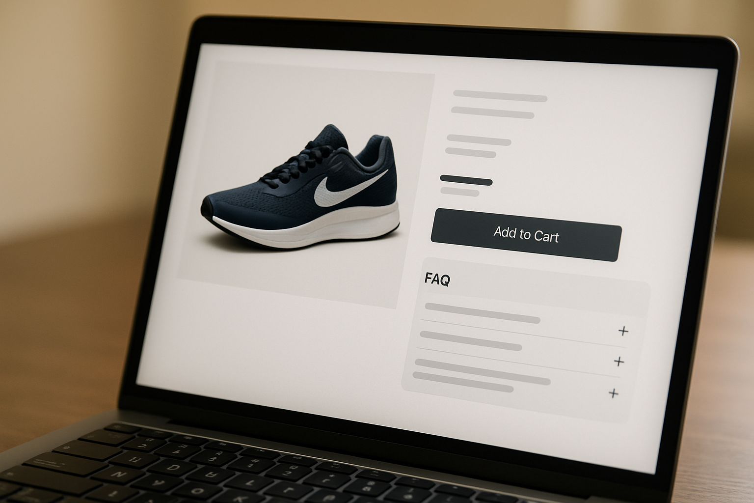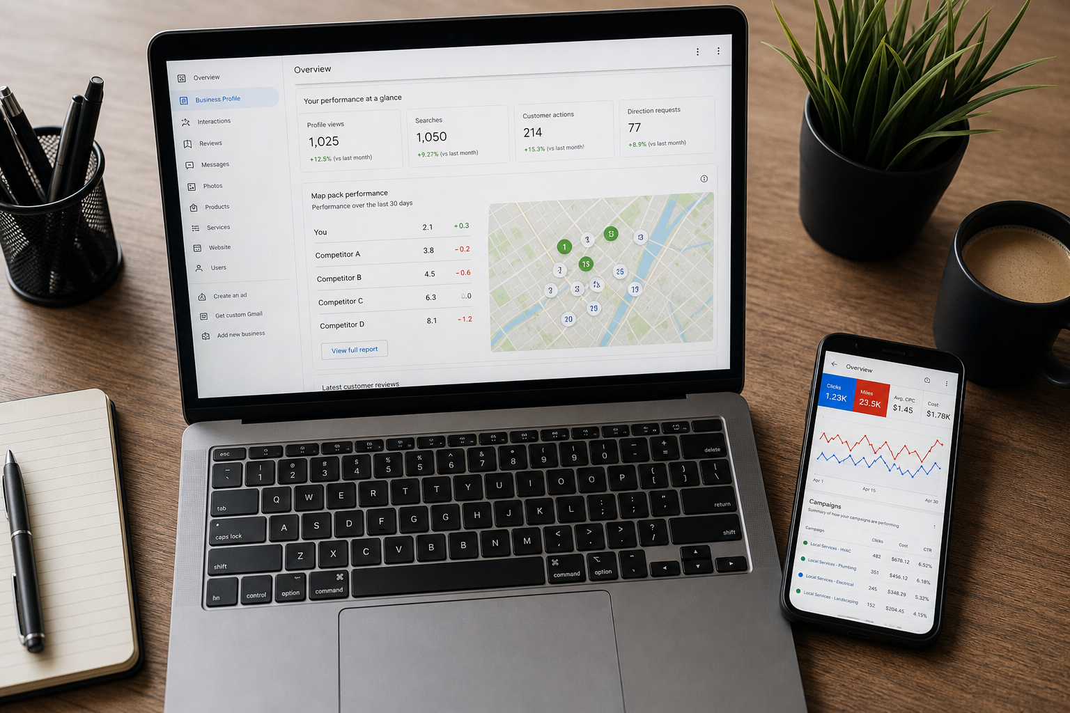

Every euro your Irish business spends on Google Ads or Meta Ads sending traffic to a broken landing page is money funnelled straight to a competitor. Sending paid traffic to a weak page is like paying to fill a leaking bucket, where every cent you put in drains out the bottom before it ever becomes a lead.
Here is the part most guides skip: landing page mistakes are not random bad luck. They are design decisions made at build time, and avoided or repeated depending on how carefully a page is put together. This is an audit, not a listicle. Below are the common landing page mistakes to avoid, each tied to a real business cost, with a fix you can action today and a 20-minute self-audit at the end. If you have ever wondered why do landing pages fail despite decent ad spend, the answers are almost always in this list.

Why Landing Page Mistakes Hit Irish SMEs Harder Than Most
If you are a multinational with a six-figure media budget, a 1% dip in conversion rate is an annoyance. For an Irish SME running a tight Google Ads budget, that same dip is the difference between a profitable month and a wasted one.
The maths is brutal at small budgets. Research suggests business websites with 10 to 15 landing pages tend to increase conversions by 55% over sites with fewer than 10. Most Irish SMEs have one. So your single page has to do all the work, and every weakness on it is amplified across every campaign you run.
We see the leak first-hand. Across the painting and home-services accounts we manage, average cost per click runs roughly $7 to $11, with monthly media budgets of around $615 to $1,310. At those prices, a page that converts at 4% instead of 8% does not just halve your leads. It doubles your cost per lead and quietly drains the budget you needed for next month.
A poor landing page does not fail loudly. It fails quietly, one wasted click at a time, while your ad account still reports “active” and your bank balance still goes down.
Every mistake in this audit maps to a cost: a higher cost per click, a worse Google Ads Quality Score, or a lead that books with someone else. Fix the page and the same ad spend works harder.
Mistake 1: A Headline That Fails to Communicate Your Value Proposition
Your headline has one job: tell a visitor, in under three seconds, that they are in the right place and what they will get. Most miss. “Welcome to ABC Painting” tells the visitor nothing they did not already know from clicking the ad.
A vague headline forces the visitor to work out your value proposition for themselves. They will not. They will hit the back button, and you have paid for that click regardless. This is one of the most common landing page design mistakes because it feels finished when it is actually empty.
The Fix
- Lead with the outcome, not your name. “Repainted in a weekend, guaranteed finish” beats a company name every time.
- Echo the search intent. If they searched “house painters Wicklow”, the word Wicklow should be visible above the fold.
- Write for a quick read. Copy at a 5th to 7th grade reading level was found to produce a median conversion rate of 11.1%, double that of college-level copy. Plain language converts.
Mistake 2: Too Many CTAs (or No Clear Primary CTA at All)
When everything is a priority, nothing is. A page with “Call us”, “Email us”, “Download brochure”, “Follow us”, “Get a quote” and a newsletter signup gives the visitor a menu, not a decision. Choice paralysis kills conversion rate.
The opposite failure is just as costly: a page with no obvious call-to-action at all, where the visitor has to hunt for how to proceed.
The Fix
- Pick one primary action per page, then repeat that same CTA two or three times as the visitor scrolls.
- Make secondary options visually quieter, for example a text-link phone number rather than a second big button.
- Write the button as a verb plus a benefit: “Get my free quote” outperforms “Submit” every time.
Mistake 3: Slow Page Load Speed and Failing Core Web Vitals
Page load speed is not a technical detail, it is a conversion lever and a cost lever. Slow pages bleed visitors before they ever see your offer, and Google factors page experience into your Google Ads Quality Score, which directly affects how much you pay per click.
Core Web Vitals are the three metrics Google watches: LCP for loading, INP (which replaced FID) for responsiveness, and CLS for visual stability. A page that fails them frustrates users and signals a poor experience to Google.
The Fix, with Irish-Specific Context
- Test the real thing. Run your page through Google PageSpeed Insights on mobile, not desktop, because that is how most of your traffic arrives.
- Host close to your audience. Irish or EU-based hosting cuts latency for Irish visitors compared to distant US servers, which helps both load time and GDPR data residency.
- Compress and lazy-load images. Oversized hero images are the single most common cause of a failing LCP we see on Irish SME sites.
| Core Web Vital | Good (pass) | Needs work | Poor (fail) |
|---|---|---|---|
| LCP (loading) | Under 2.5s | 2.5s to 4s | Over 4s |
| INP (responsiveness) | Under 200ms | 200ms to 500ms | Over 500ms |
| CLS (visual stability) | Under 0.1 | 0.1 to 0.25 | Over 0.25 |
Mistake 4: No Social Proof or Trust Signals Irish Visitors Actually Recognise
A landing page asking a stranger for their phone number is asking for trust before earning it. Social proof and trust signals close that gap. Generic “5 star service” claims do not, because anyone can type those words.
What works for an Irish audience is specificity they recognise: a real Greystones or Dublin address, Google reviews with local place names, and accreditations that mean something here, such as a trade body membership or a verified local business listing.
The Fix
- Use real, attributed reviews with a first name and a town, pulled from your Google Business Profile, not anonymous quotes.
- Show recognisable trust signals above the fold: review stars, trade accreditations, years in business, and a genuine local address.
- Be selective. One or two proof points that directly support the offer beat a wall of logos that clutters the page and distracts from the CTA.
For trades specifically, the relationship between credibility and enquiries is direct, which we cover in more depth in our guide on how landing page design impacts lead generation for trades.
Mistake 5: Poor Mobile Optimisation in a Mobile-First Irish Market
Irish traffic is overwhelmingly mobile. Unbounce data shows a large majority of landing page visits are on mobile, commonly cited at around 83%. If your page works on a desktop and merely tolerates a phone, you have inverted your own priorities.
Poor mobile optimisation shows up as tap targets too small to hit, text that needs pinch-zooming, forms that fight the on-screen keyboard, and a CTA buried three scrolls down. Each one is a friction point, and friction on mobile is conversion lost.
The Fix
- Design for the phone first, then scale up to desktop, never the reverse.
- Make the phone number tap-to-call. For home services, phone calls consistently match or outrank web forms as the lead channel, so a tappable number is not optional.
- Put the primary CTA in the first mobile screen, visible without scrolling.
Mistake 6: Cluttered Layout and Buried Value Proposition Above the Fold
Above the fold is the screen a visitor sees before scrolling. If your value proposition and primary CTA are not in it, you are relying on people to scroll to find your reason for existing. Many will not.
Clutter is the enemy of visual hierarchy. When a page throws ten competing elements at a visitor, their eye has nowhere to land, and a confused visitor does not convert. White space is not wasted space, it is what makes the one thing that matters stand out.

The Fix
- Pass the five-second test. Show the page to someone for five seconds, then ask what you do and what they should click. If they cannot answer, the hierarchy is broken.
- Earn every element. If a section does not move the visitor toward the CTA, cut it.
- Lead with one clear value proposition, supported by a subhead, then the CTA, all above the fold on mobile.
Mistake 7: Forms That Ask Too Much Too Soon (Including a GDPR Consent Problem)
Every form field is a small ask, and asks add up. Around 27% of potential leads will abandon a form if they think it is too long. If you genuinely need only a name and a phone number to follow up, asking for nine fields is choosing to lose a quarter of your leads for data you will never use.
There is a second, distinctly Irish and EU problem most guides ignore entirely: GDPR consent. A pre-ticked consent box, or vague catch-all wording, is not compliant and it erodes trust at the exact moment you are asking for it.
Under Irish and EU rules, consent must be freely given, specific and unambiguous. That means an unticked box by default and clear wording about what you will do with the data. The Data Protection Commission sets out the requirements. Getting this right protects you legally and reassures the visitor.
| Form approach | Red flag | Green flag |
|---|---|---|
| Number of fields | 9+ fields “just in case” | Only what you need to follow up |
| GDPR consent | Pre-ticked box, vague wording | Unticked by default, specific wording |
| Phone option | Form only | Form plus a tap-to-call number |
| Button copy | “Submit” | “Get my free quote” |
The Fix
- Strip the form to essentials. Reducing fields is one of the highest-leverage changes you can make to a lead-generation page.
- Make consent unticked and specific. State plainly what you will send and how often.
- Offer a phone path alongside the form for the many Irish buyers who would rather just call.
Mistake 8: Ad-to-Page Message Mismatch Destroying Your Quality Score
This is the most expensive mistake on the list, and the most invisible. If your ad promises “Free home valuation in Wicklow” and the landing page headline says “Welcome to our estate agency”, you have broken the promise that earned the click. The visitor feels the disconnect instantly and bounces.
Message match is also a Google Ads Quality Score factor. Sending paid search traffic to a generic homepage, where navigation distractions and message mismatch combine, can suppress conversion rates by four to five times compared to a dedicated landing page. Worse, a poor Quality Score raises your cost per click, so the same mismatch makes every future click more expensive too.
Message match is the cheapest conversion win you will ever make. Change a headline to echo your ad and you can lift conversion without touching design, code, or budget.
The Fix
- Mirror the ad in the headline. If the ad says “Free home valuation”, the page headline should say “Free home valuation”.
- Build a page per campaign theme, not one catch-all page for every ad group.
- Never send paid traffic to your homepage. A dedicated landing page beats a homepage on every metric that matters.
Message mismatch usually starts in the ad account, so it is worth reading alongside the common Google Ads mistakes Irish businesses make to fix both ends of the click at once.
Mistake 9: Generic or Stock Imagery That Erodes Trust
The smiling stock model in a headset has been on ten thousand websites, and your visitors have seen them all. Generic stock imagery signals one thing: this could be anyone. For a local Irish trade or clinic, that is the opposite of what you want.
Real imagery does the heavy lifting that stock cannot. A photo of your actual van outside an actual Greystones house, your real team, or your finished work tells the visitor you exist, you are local, and you have done this before.
The Fix
- Use real photos of your team, premises and completed jobs. Phone-camera authenticity beats polished stock.
- Show before-and-after work where relevant, which doubles as social proof.
- If you must use stock, choose neutral context shots, never posed people pretending to be your team.
Mistake 10: Designing Desktop-First in a Mobile-First Country
This is mistake five’s bigger sibling, and it is a mindset problem, not just a layout one. When a page is conceived on a designer’s large monitor, every decision is made for a screen most of your visitors will never use. The mobile version becomes an afterthought that gets squashed in at the end.
The result is predictable: hero images that load slowly on a phone, CTAs pushed below the fold, and forms that are painful to complete one-thumbed. In a market where the clear majority of clicks are mobile, designing desktop-first is designing for the minority.
Design on a phone screen first
Big tappable buttons and numbers
Light, fast, single-column flow
The Fix
- Prototype on a phone and only then scale up to desktop.
- Keep modest device bid adjustments on both, because desktop still converts at a similar cost even when mobile dominates volume.
- Test the full journey on a real phone, tapping every button and submitting the form, before you spend a cent on ads.
The 20-Minute Irish Business Landing Page Self-Audit Checklist
You do not need a developer to find most of these leaks. Work through the checklist below with your live page and your live ad open. Tick each item you pass, and watch the counter.
Landing Page Self-Audit (tick as you go)
- Message match: the headline echoes the ad that sent the visitor.
- Value proposition: what you offer is clear within five seconds.
- Above the fold: the primary CTA is visible on a phone without scrolling.
- One primary CTA: a single clear action, repeated, not five competing ones.
- Button copy: a verb plus a benefit, not “Submit”.
- Load speed: passes Core Web Vitals on mobile in PageSpeed Insights.
- Mobile layout: readable without zooming, tappable buttons.
- Tap-to-call: the phone number is a tappable link.
- Trust signals: real reviews, local address, accreditations on show.
- Short form: only the fields you genuinely need.
- GDPR consent: unticked by default, with specific wording.
- Real imagery: your team, premises or work, not generic stock.
- Visual hierarchy: white space, one thing the eye lands on.
- No site nav: nothing pulling visitors away from the action.
- Form tested: you submitted it and the lead actually arrived.
0 / 15 items checked
Quick Landing Page Health Check
Answer eight yes/no questions for an instant, colour-coded score and a plain recommendation.
Tick every statement that is true of your page:
These Mistakes Are Cheaper to Fix at Build Time
Here is the uncomfortable truth running through every mistake above: they are all design decisions. They cost almost nothing to get right when the page is built, and a fortune to retrofit once you are paying for traffic that bounces.
Retrofitting conversion rate optimisation onto a page that was never built for conversion is patching a leak underwater. You can do it, and we often do, but it is slower and more expensive than building correctly from the start. When we build a page properly, message match, mobile-first layout, fast load speed and GDPR-compliant forms are baked in, not bolted on.
The payoff compounds. On one painting account we manage, steady optimisation work brought cost per tracked lead down from around $111 to the low $60s to low $80s over five months. A page built right from day one starts closer to that floor instead of climbing down to it. That is the case for treating website design Ireland as a conversion investment, not a cosmetic one.
A managed paving and landscaping account we built and run grew its website lead database to well over 500 captured form submissions across the engagement, with monthly leads ranging from roughly 12 to 53 and split fairly evenly between calls and forms. That volume sits on a page built for conversion from the first wireframe.
If you want the deeper version of this argument applied to your service pages, see service page structure that drives enquiries for Irish trades and clinics, and our specific breakdown of website design mistakes that cost Irish businesses leads.
Stop paying to fill a leaking bucket
We design and build landing pages for Irish businesses that turn your ad spend into actual enquiries, with message match, speed and GDPR-ready forms built in from the start.
FAQs: Landing Page Mistakes
What makes a killer landing page?
A killer landing page matches the ad that sent the visitor, leads with one clear value proposition, and offers a single primary call-to-action. It loads fast on mobile, passes Core Web Vitals, carries trust signals an Irish audience recognises, and asks only for the information you need to follow up. Every element earns its place by moving the visitor toward that one action.
What should every landing page have?
Every landing page needs a benefit-led headline, a supporting subhead, a clear primary CTA above the fold, social proof or trust signals, a short form, fast load speed and a mobile-first layout. For Irish home-services businesses, add a tap-to-call number, because calls often outperform forms as a lead channel.
What is the one-page landing page rule?
The one-page rule means a campaign landing page should focus on a single offer and a single action. There is no site navigation pulling visitors elsewhere, no competing CTAs, and nothing on the page that does not serve the one goal. Remove the menu and the distractions, and you reduce the friction between interest and action.
What are the most common website design mistakes?
The most common website design mistakes are slow page load speed, poor mobile optimisation, cluttered layouts, weak or buried value propositions, missing trust signals, and unclear calls-to-action. On landing pages specifically, ad-to-page message mismatch and overly long forms do the most quiet damage to conversion rate.
What is not recommended for a landing page?
It is not recommended to include full site navigation, multiple competing CTAs, long forms, pre-ticked GDPR consent boxes, autoplay video with sound, or messaging that does not match the ad. Each of these adds friction or breaks trust, and on a paid campaign that means you are paying for clicks that will not convert.