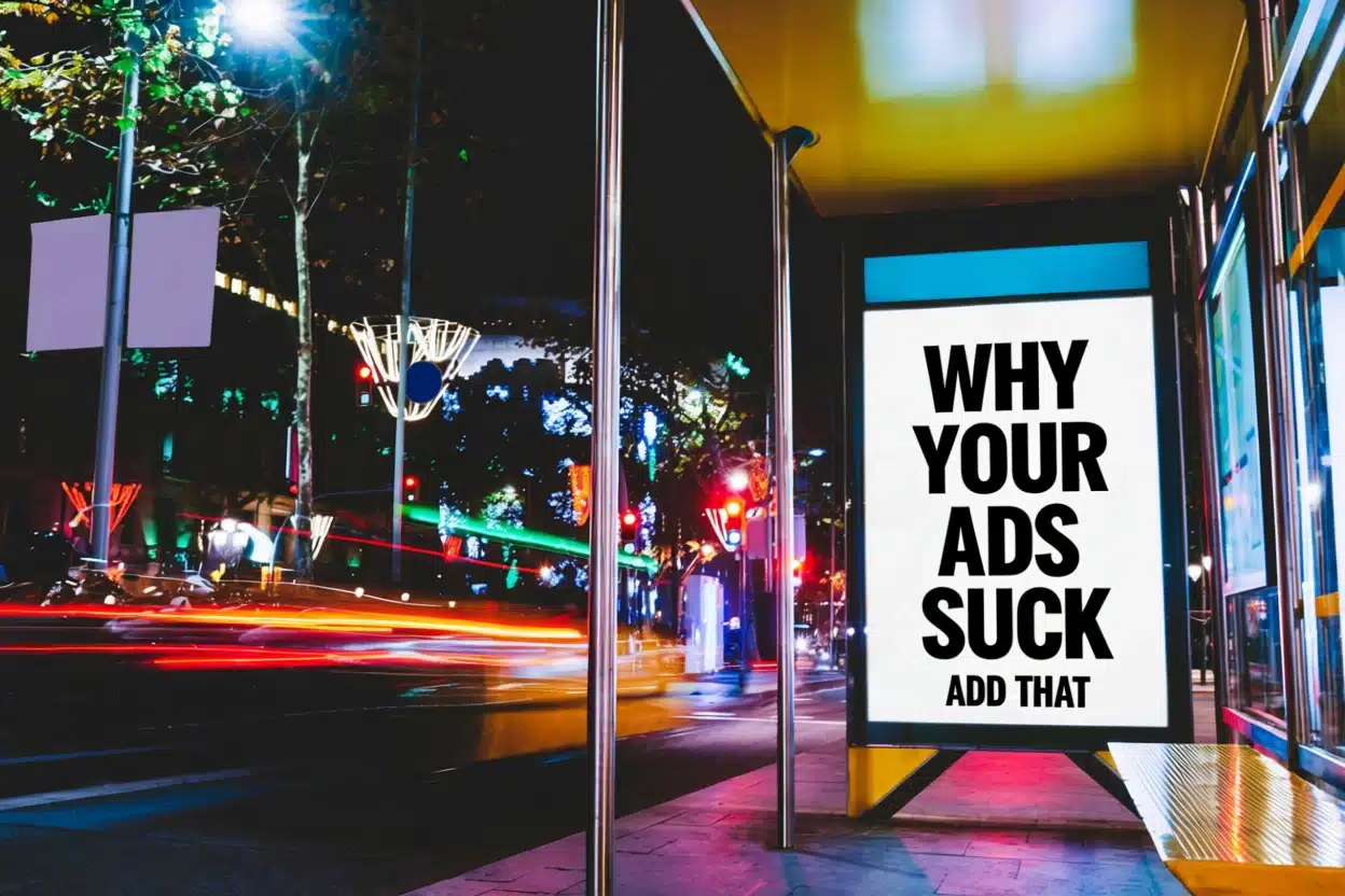
Your website is often the first thing people see when they’re looking for a business in Ireland. It’s like your digital shop window. But, a lot of Irish businesses are making simple website design mistakes that are costing them customers. We’ve looked at what goes wrong and how you can fix it to make sure your website actually helps you get more leads, not scare them away. Let’s talk about these common website design mistakes in Ireland.
Key Takeaways
- Make sure your website works well on phones. Lots of people in Ireland browse on their mobile, so if it’s hard to use on a small screen, you’ll lose visitors.
- Keep your website’s menu simple. If people can’t easily find what they’re looking for, they’ll leave. Stick to a few clear options.
- Speed up your website. If it takes too long to load, people won’t wait around. Optimise images and code to make it faster.
- Tell people what you want them to do. Use clear buttons like ‘Get a Quote’ or ‘Contact Us’ so visitors know the next step.
- Keep your website content fresh and easy to read. Walls of text or old information won’t keep people interested.
Introduction: Why Website Design Matters for Irish Businesses
Right then, let’s talk about your website. For any business in Ireland, it’s pretty much your digital shop window. Think about it – it’s often the very first thing a potential customer sees. If that window is dusty, cluttered, or just plain confusing, they’re likely to walk right past. We’ve seen it time and again with common web design errors in Ireland; businesses are losing out simply because their website isn’t pulling its weight. These aren’t just minor annoyances; these are genuine Irish business website problems that can have a real impact on sales in Ireland.
It’s not about having the flashiest graphics, though that helps. It’s about making things easy for people. Can they find what they’re looking for quickly? Does it look decent on their phone? Does it load up without making them wait ages? These might seem like small details, but they add up. A poorly designed website can actively drive customers away, costing you money you could be using elsewhere.
We’re going to look at five of the most common mistakes we see. These are the things that make people think, "Why my website sucks?" and then click away to a competitor. Getting these right means your website actually works for you, bringing in leads instead of scaring them off. It’s about making sure your online presence is as solid as your physical one, if not more so. For Irish startups in 2024, overcoming challenges like budget constraints and competition requires a strong online presence, and your website is the cornerstone of that digital presence.
The digital world moves fast, and if your website isn’t keeping up, you’re falling behind. It’s not just about looking good; it’s about functioning brilliantly for your customers.
Mistake 1: Poor Mobile Responsiveness - The Unseen Lead Killer
Right, let’s talk about something that’s probably costing you customers without you even realising it: how your website looks and works on a phone. We all use our phones for everything these days, don’t we? Checking emails, looking up directions, and yes, browsing for businesses. If your website is a nightmare to use on a small screen, people just won’t bother. They’ll tap back and find someone else. It’s that simple.
Why Mobile Matters in Ireland
Think about it. How often do you pull out your phone to quickly search for a service or product while you’re out and about? A lot of people in Ireland are doing the same. Whether they’re on the bus, having a cuppa, or just relaxing on the sofa, they’re using their phones. If your site isn’t built to handle this, you’re basically shutting the door on a huge chunk of potential customers. It’s not just about looking good; it’s about being accessible. A clunky mobile site means people can’t easily find your phone number, read your services, or make a booking. That’s a direct hit to your leads.
Signs Your Website Isn't Mobile-Friendly
So, how do you know if your site is letting you down on mobile? It’s usually pretty obvious once you look. First off, is the text tiny? Do you have to pinch and zoom just to read a sentence? That’s a big red flag. Are buttons and links so close together you keep accidentally tapping the wrong one? That’s annoying for anyone. Maybe the whole layout looks squashed or cut off, like it was designed for a much bigger screen and just crammed onto a smaller one. Even worse, are forms impossible to fill out, or do images just not load properly? These aren’t minor glitches; they’re major barriers. A website that’s difficult to use on a phone is a website that loses business.
Here are a few quick checks:
- Text Size: Can you read everything comfortably without zooming?
- Navigation: Are buttons and links easy to tap with a thumb?
- Layout: Does the content adapt to the screen, or is it a mess?
- Forms: Are they simple to complete on a small keyboard?
If you’re nodding along to any of these, it’s time to get it sorted. Making your site work well on mobile isn’t just a nice-to-have; it’s a must-have for any Irish business wanting to connect with customers online. You can check how your site performs using tools like Google’s Mobile-Friendly Test, which gives you a clear idea of where you stand. Getting your website right for mobile users is a key step in building an Irish brand online.
It’s easy to get caught up in how a website looks on your own big monitor, but the reality is, most people are viewing it on the go. If it’s not a smooth experience for them, they’re gone. No second chances.
Mistake 2: Confusing Navigation - Sending Potential Customers Astray

Ever felt like you’re lost in a maze trying to find something on a website? That’s exactly what happens when your site’s navigation is a mess. It’s one of those common website mistakes that cost customers, and it’s surprisingly easy to get wrong. Think of your website’s menu like the map for your business. If it’s unclear, too long, or just plain illogical, people will get frustrated and leave.
Why Mobile Matters in Ireland
It’s not just about having a menu; it’s about how usable it is, especially on phones. A huge chunk of people in Ireland browse on their mobile devices. If your navigation is fiddly or hard to see on a smaller screen, you’re basically telling a big portion of potential customers to go elsewhere. This is a massive oversight, and it’s happening more often than you’d think.
Signs Your Website Isn't Mobile-Friendly
So, how do you know if your navigation is causing problems? Here are a few red flags:
- Too Many Options: If your main menu has more than seven items, it’s probably too much. People get overwhelmed, just like at a restaurant with a menu the size of a novel. They’ll likely stick to what they know or just give up.
- Vague Labels: Using terms like "Solutions" or "Resources" might make sense to you, but they can be confusing for first-time visitors. Be specific. Instead of "Solutions," try "Our Services." Instead of "Resources," maybe "Helpful Guides."
- Hidden Key Pages: If it takes more than a couple of clicks to find your contact details or pricing, that’s a problem. These important pages should be easy to find, ideally in the main navigation.
- Mobile Clutter: On a phone, does your menu collapse into a tiny, hard-to-tap icon? Are the links too close together? If you can’t easily tap each item with your thumb, it’s not user-friendly.
A website should guide visitors, not make them guess. Every click should feel intentional, leading them closer to what they need, whether that’s information, a product, or a way to get in touch. If your site feels like a dead end, you’re losing business.
For example, a local Dublin law firm noticed a big drop in people contacting them. After looking into it, they realised their "Services" page was buried three clicks deep. They moved it to the main navigation, and saw a 35% increase in enquiries within a month. It’s a simple fix, but it made a huge difference.
Mistake 3: Slow Loading Speeds - Losing Leads Before They Even See Your Content
Right, let’s talk about speed. You know when you click on a link and then just stare at a blank screen, tapping your fingers, wondering if it’s even going to load? Yeah, your potential customers do too. And they’re not going to wait around.
A slow website is like a shop with the door locked – people just walk away. It’s a real shame because you might have the best products or services in Ireland, but if people can’t get to them quickly, they’ll never know. We’re talking about losing customers before they even get a chance to see what you’re offering. It’s a pretty big deal, honestly.
Understanding User Patience and Bounce Rates
People just don’t have the patience they used to. If your website takes more than a few seconds to load, especially on a mobile device, visitors are likely to hit the back button. This is called a bounce, and it’s a killer for your online presence. Studies show that a significant chunk of visitors will leave if a page takes longer than three seconds to appear. For Irish businesses, this means potential leads are vanishing into thin air.
Here’s a rough idea of what happens:
- 1-second delay: You might lose around 7% of your potential customers.
- 3-second delay: This jumps up to about 38% of visitors leaving.
- 4-second delay: Expect to lose roughly 25% of visitors before they even see your content. This is a common issue for many Irish businesses.
So, what can you do about it? It’s not all doom and gloom. There are practical steps you can take to speed things up:
- Optimise your images: Big, uncompressed photos are a major culprit. Make sure they’re the right size and format.
- Choose good hosting: Where your website lives matters. A reliable hosting provider can make a big difference.
- Clean up your code: Too many bits of code or unnecessary extras can slow things down.
- Use caching: This is like giving your website a short-term memory so it doesn’t have to load everything from scratch every time.
The faster your website loads, the happier your visitors will be. This simple fact directly impacts how many people stick around long enough to become a lead or a customer. It’s a technical issue, sure, but the impact is very much about human behaviour and business results.
Don’t let slow loading speeds be the reason potential customers choose your competitors. Getting your site up to speed is a smart move for any business looking to grow.
Mistake 4: Lack of Clear Calls to Action (CTAs) - Missing Opportunities
Right, so you’ve got people on your website. They’re looking around, maybe they’re interested. But then what? If you haven’t told them what to do next, they’re probably just going to leave. It’s like having a shop with no ‘buy now’ button, or no one at the counter to ask. It’s a missed chance, plain and simple.
What Makes a Compelling CTA?
Think about what you want someone to do. Do you want them to book a meeting? Request a quote? Sign up for a newsletter? Whatever it is, you need to make it super obvious. Don’t just put ‘Click Here’. That tells them nothing. Instead, try something like:
- Get Your Free Quote Today
- Book a Consultation Now
- Download Our Latest Guide
- Join Our Mailing List
These are much clearer and tell people exactly what they’ll get.
It’s also really important that these buttons stand out. If your ‘Contact Us’ button is the same colour as the background, no one’s going to see it. Use a contrasting colour that pops. You want it to be the first thing people notice when they’re ready to take the next step.
You shouldn’t just have one CTA at the very bottom of your page. Think about putting them in logical places throughout your content. If someone’s reading about a service and they’re clearly interested, give them a chance to act on that interest right then and there. It cuts down on the effort they have to make and makes it easier for them to become a customer.
Here’s a quick look at what works and what doesn’t:
| What Works | What Doesn’t Work |
|---|---|
| Action-oriented language (e.g., "Get", "Book") | Generic phrases (e.g., "Click Here") |
| Contrasting, visible colours | Blends in with background |
| Clear benefit stated (e.g., "Free Quote") | Vague or no benefit |
| Placed strategically throughout the page | Only at the very bottom |
Mistake 5: Outdated or Irrelevant Content - Failing to Connect with Your Audience
Right, let’s talk about content. You know, the words and pictures on your website. It’s easy to get this wrong, and honestly, it happens more often than you’d think. If the information on your site hasn’t been updated in ages, it can make your whole business look a bit, well, dusty. Think about it: if your prices are old, your services have changed, or your contact details are a mess, potential customers might just assume you’re not really on the ball. This lack of fresh, relevant content can seriously damage your credibility.
People visiting your site are looking for answers and solutions now. If they land on a page that talks about a product you no longer sell, or mentions an event that happened last year, they’re going to get confused. They might even think you’ve gone out of business. It’s like walking into a shop and seeing last season’s stock piled high – it just doesn’t inspire confidence.
Here are a few things that often get overlooked:
- Outdated Service/Product Information: Are your descriptions still accurate? Have you added new services or discontinued old ones? Make sure this is crystal clear.
- Old Blog Posts or News: If your blog hasn’t seen a new post in months, or even years, it sends a signal that you’re not actively engaged. Even a quick update saying "We’re still here and working hard!" is better than nothing.
- Broken Links: These are the silent killers. A link that goes nowhere is a dead end for your visitor and a sign of neglect. Regularly check that all your internal and external links are working.
- Irrelevant Testimonials: While great to have, old testimonials might not reflect your current service quality or client base. Try to get recent ones from happy customers.
Keeping your website content current isn’t just about looking good; it’s about being useful. If you’re not providing up-to-date information, you’re not helping your potential customers, and that’s a missed opportunity to build trust and secure new business. It’s worth spending a bit of time to get this right, maybe even looking at a digital marketing agency in Ireland if it feels like too much to handle alone.
Ultimately, your website content needs to speak directly to your audience, answering their questions and showing them you’re the right choice. If it’s stale, it’s not doing its job.
Conclusion: Investing in Smart Website Design for Irish Business Growth
So, we’ve gone through some common website design slip-ups that can really hurt Irish businesses. It’s easy to get caught up in the day-to-day running of things and let the website slide, but honestly, it’s often the first place people get to know you. Making sure your site is easy to use, especially on a phone, is non-negotiable these days.
Think about it: if your site is slow to load, confusing to navigate, or doesn’t clearly tell people what you want them to do next, they’ll just go somewhere else. It’s not about having the flashiest design; it’s about making it simple for potential customers to find what they need and take the next step. This is key for improving online presence for Irish companies.
Here are a few things to keep in mind:
- Mobile First: Always check how your site looks and works on a smartphone. Most people browse this way.
- Keep it Simple: Clear navigation and straightforward language make a huge difference.
- Speed Matters: Nobody waits around for a slow website. Optimise your images and code.
- Tell Them What to Do: Use clear calls to action so visitors know how to get in touch or buy.
- Build Trust: Show that you’re a real, local business that people can rely on.
Avoiding pitfalls in website creation Ireland means focusing on the user. It’s about creating a positive experience that encourages people to connect with you. By addressing these common mistakes, you’re not just fixing a website; you’re investing in growth and making it easier for your business to be found and chosen. Aiming for the best website in Ireland means putting your customer’s needs at the centre of your design choices.
So, to wrap things up, making your website look great and work well is a smart move for any Irish business wanting to grow. A good website is like your shop window online, and we can help make it shine. Ready to boost your business? Get in touch with us today to see how we can help your business grow online!
Don't Let Your Website Be a Missed Opportunity
So, we’ve gone through some of the biggest website design slip-ups that Irish businesses are making, the kind that quietly send potential customers packing. It’s easy to get caught up in how a site looks, but if it’s slow, confusing to use, or doesn’t tell people what to do next, it’s just not doing its job. Think of your website as your digital shop front – it needs to be welcoming, easy to get around, and make it clear how people can do business with you. By taking a good look at these common mistakes and making some straightforward changes, you can turn your website from a passive online presence into a real lead-generating tool for your business. Don’t let these simple fixes hold you back; your next customer might be just a click away.
Frequently Asked Questions
Why is it important for my Irish business website to work well on phones?
Lots of people in Ireland use their phones to look at websites. If your website is hard to use on a phone, people might get annoyed and go to a competitor’s site instead. Making sure it looks good and is easy to use on phones helps you keep customers.
My website has a lot of pages. How can I make it easier for people to find what they need?
Try to keep your main menu simple with only a few choices. Use clear words that people will understand. Think of it like organising a shop – you want customers to find what they’re looking for without getting lost.
What happens if my website takes too long to load?
If your website is slow, people get impatient and might leave before they even see your content. It’s like waiting ages for a shop door to open. Making your website load quickly helps keep visitors interested.
What's a 'Call to Action' (CTA) and why do I need one?
A CTA is like a sign that tells people what to do next, such as ‘Buy Now’ or ‘Contact Us’. Without clear CTAs, visitors might not know how to buy from you or get in touch, meaning you miss out on customers.
How can I make my website seem more trustworthy to Irish customers?
You can add things like your local address, customer reviews from people in Ireland, and mention how long you’ve been in business. This helps people feel more confident choosing your business.
Why is having up-to-date content important?
If your website has old information or looks out of date, it can make your business seem unprofessional. Keeping your content fresh and relevant shows customers you’re active and care about providing good information.
How can I check if my website is mobile-friendly?
The easiest way is to open your website on your own phone. Can you easily read the text? Can you click buttons without zooming in? If it’s tricky to use, it’s probably not mobile-friendly enough.
What's the quickest way to improve my website's speed?
Making your image files smaller is often a big help. Also, check if you have too many extra features (plugins) that might be slowing things down. There are free online tools that can tell you how fast your site is loading.