When you run a trades business, getting new customers through the door – or rather, onto your website – is key. A big part of that is your landing page. It’s the first thing people see when they click on an ad or a link, and it needs to do a good job of convincing them to get in touch. Getting the landing page design trades right can make a real difference to how many people actually contact you for a quote or service. It’s not just about looking nice; it’s about making it easy for potential customers to take the next step.
Key Takeaways
- A well-designed landing page for trades businesses clearly shows what you offer and why someone should choose you.
- Make sure your landing page works perfectly on phones, as many customers will be looking you up on the go.
- Using images and videos that show your work can really help convince potential clients.
- Keep the contact form simple and only ask for the information you absolutely need.
- Testing different versions of your landing page helps you find out what works best to get more leads.
Why Landing Page Design Matters for Trades Businesses
Right then, let’s talk about landing pages for tradespeople. If you’re pouring money into advertising, hoping to get more customers, but it feels like the leads are just… not showing up, your landing pages might be the culprit. It’s not just another page on your website; it’s your main chance to turn someone who’s just browsing into someone who actually wants your service. When it’s done well, a landing page works around the clock to get people to take action.
Think about it. You’ve got a potential customer who’s seen your advert or clicked your link. They land on your page. What do they see? Is it clear what you do and why they should pick you? Or is it a confusing mess that makes them want to click away? A well-designed landing page keeps that promise you made in your ad and clearly asks the visitor to do something specific. This is a big part of effective lead generation strategies for tradespeople.
Here’s why it’s so important:
- First Impressions Count: For trades businesses, trust is everything. A professional, clean landing page signals reliability. A messy or outdated one can make people doubt your professionalism before you’ve even spoken.
- Guides the Customer: Unlike your main website, a landing page has one job. It focuses the visitor on a single goal, like requesting a quote or booking a service. This simplicity helps them make a decision without getting sidetracked.
- Better Conversion Rates: Studies show that dedicated landing pages convert much better than general website pages. They’re built specifically to turn visitors into leads. For example, some businesses see conversion rates of over 11% with well-optimised pages, compared to the average of 2.35%.
The goal is to make it as easy as possible for someone to say ‘yes’ to your offer. This means removing distractions and clearly showing them the benefit of taking the next step. It’s about simplifying their decision-making process.
When you get your landing page right, it’s a powerful tool for your lead generation strategies for tradespeople. It’s not just about looking good; it’s about getting results. Looking at some best landing pages for contractors can give you a good idea of what works. Making sure your page is easy to use, especially on a phone, is also key. These trade business landing page tips can really make a difference to how many people actually get in touch.
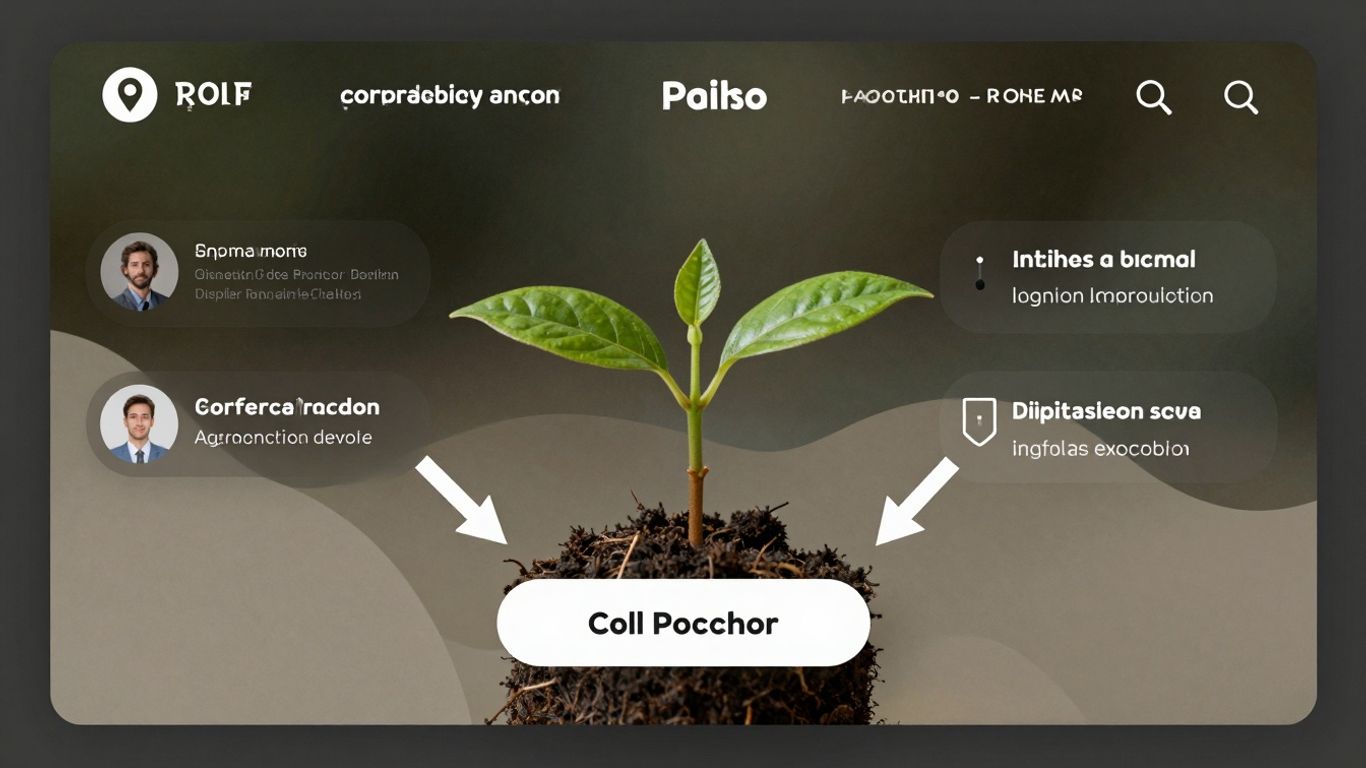
Key Elements of an Effective Landing Page for Trades
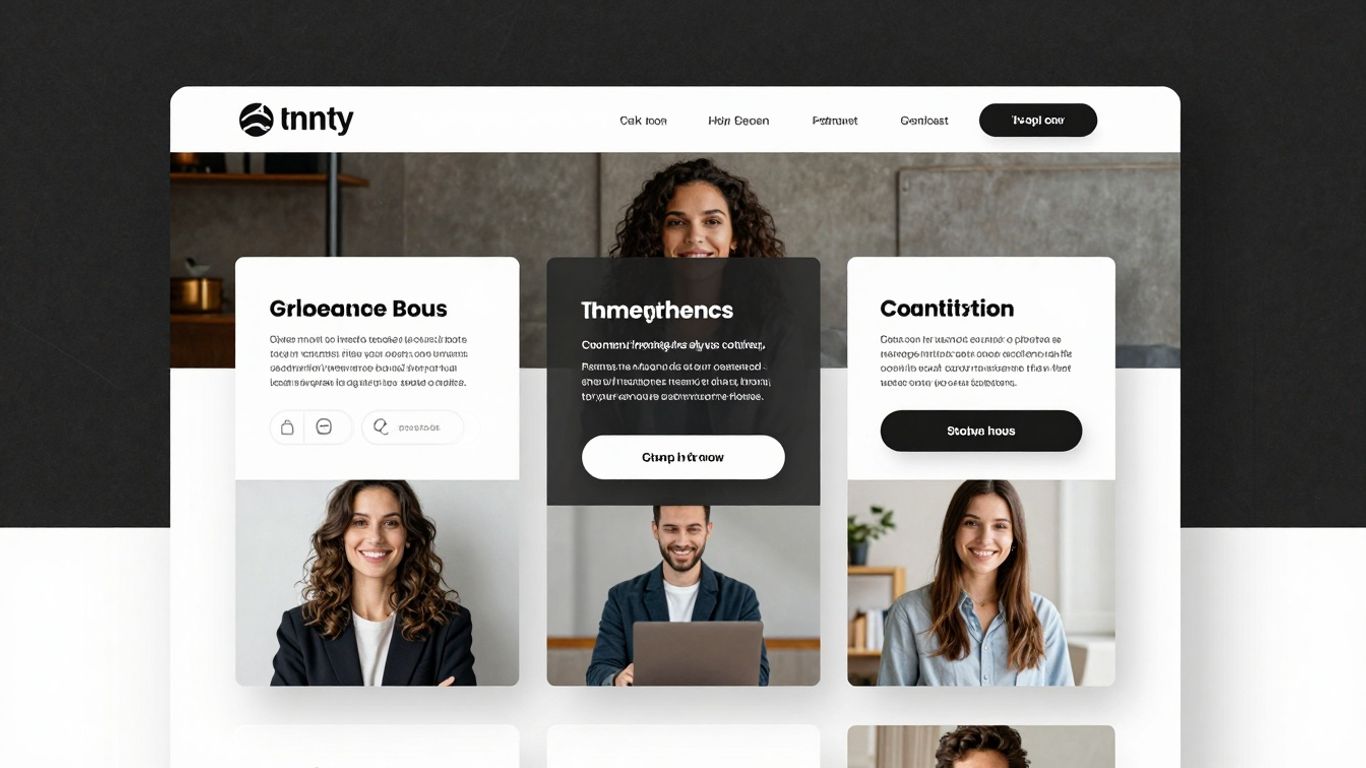
Right then, let’s talk about what actually makes a landing page work for trades businesses. It’s not just about having a page online; it’s about having one that actually brings in customers. Think of it as your digital shop window, but instead of just looking pretty, it needs to get people to pick up the phone or fill out a form.
Compelling Headline and Subheadline
This is the first thing anyone sees, so it needs to grab them. Your headline should clearly say what you do and what benefit the customer gets. It needs to match whatever brought them to the page in the first place. If someone clicked an ad for ‘Emergency Boiler Repair’, the headline needs to say exactly that, not something vague. The subheadline can then add a bit more detail, like ’24/7 Service Across Manchester’ or ‘Fixed Right, First Time’. It’s all about making a promise and keeping it straight away.
Clear and Concise Value Proposition
So, why should they choose you? Your value proposition is your answer. It’s not just listing services; it’s explaining the benefit of those services to the customer. Are you the quickest? The most reliable? The best value? For example, instead of just saying ‘Plumbing Services’, try ‘Fast, Reliable Plumbing Repairs – Get Your Drains Unblocked Today’. It tells them what you do and the immediate result they’ll get. This is where you show you understand their problem and offer a straightforward solution.
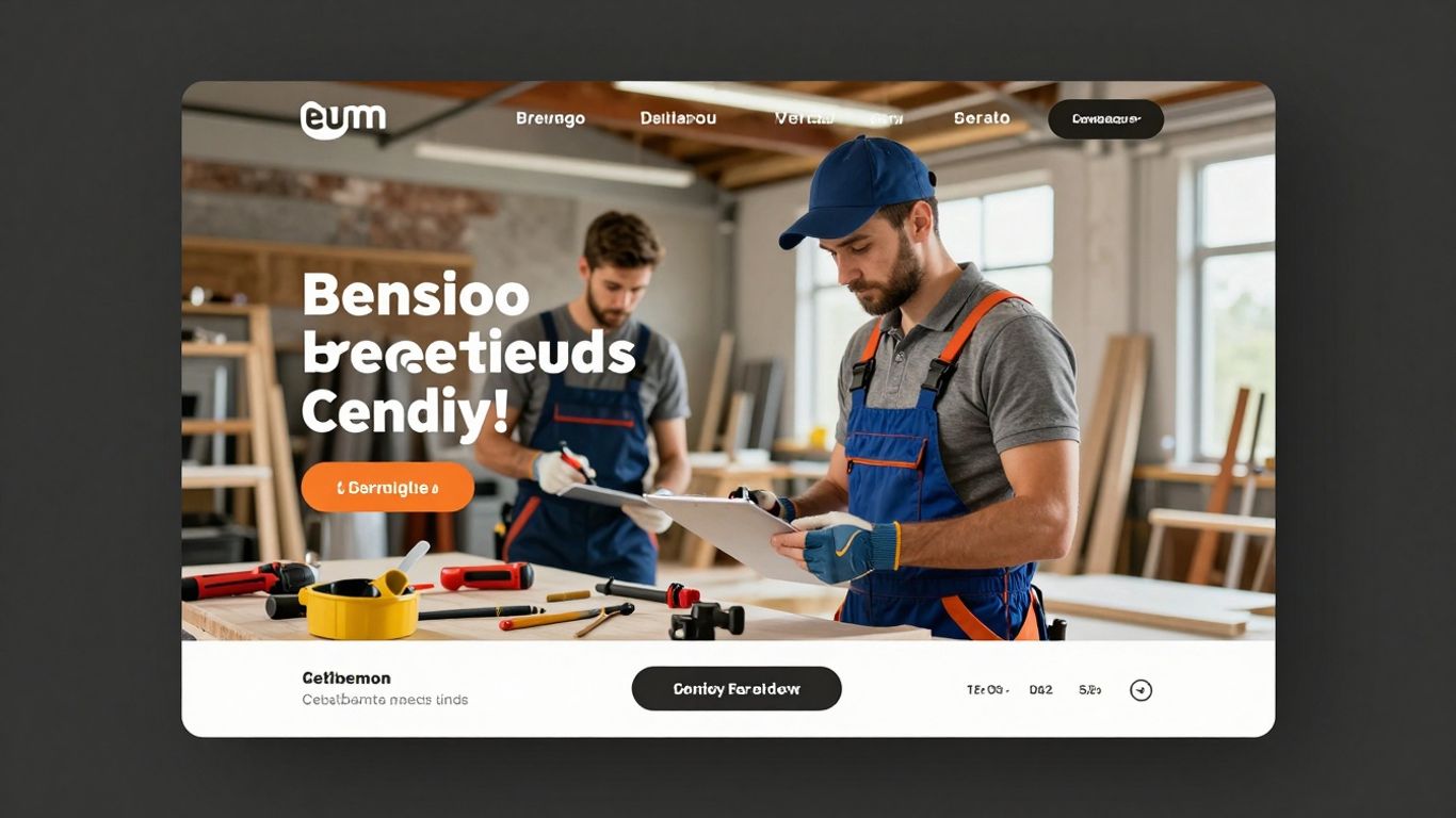
High-Quality Visuals (Images & Videos)
People are visual. A good picture of your team at work, or a short video showing a job completed well, can make a big difference. It helps build trust and shows the quality of your work. Avoid stock photos that look a bit fake. Real images of your actual work and your staff tend to connect better with potential customers. Just make sure they look professional, not like holiday snaps.
Strong Call-to-Action (CTA)
What do you want people to do? Make it obvious! Your CTA button should stand out and use clear, action-oriented text. Instead of ‘Submit’, try ‘Get a Free Quote Now’ or ‘Book Your Service Today’. You want to make it as easy as possible for them to take that next step. Remove any distractions, like links to other parts of your website, that might pull them away from the main goal.
Trust Signals: Testimonials, Reviews, and Certifications
Nobody wants to hire a cowboy. Showing off positive reviews from previous customers, testimonials, or any industry certifications you hold can really build confidence. Think about including logos of any accreditation bodies or awards you’ve won. This social proof is powerful because it shows potential customers that others have already trusted you and were happy with the results. It’s like a digital nod of approval.
Simple and Relevant Lead Capture Form
When you ask for information, keep it short and sweet. People are often hesitant to give away too much personal detail online. Only ask for what you absolutely need to get back to them, like their name, phone number, and maybe a brief description of the job. A long, complicated form is a sure way to lose a potential lead. A simple form makes it much easier for them to get in touch, which is exactly what you want. A well-designed landing page is key to turning visitors into customers.
The goal of a landing page is simple: to get the visitor to take one specific action. Everything on the page, from the text to the images, should guide them towards that single objective without unnecessary distractions.
Designing for Mobile Users in the Trades
Right then, let’s talk about phones. It’s pretty obvious by now that most people are browsing the web on their mobile devices, and for trades businesses, this is a massive point. If your landing page isn’t playing nicely on a smartphone, you’re basically telling potential customers to go elsewhere. We’re talking about web design for construction businesses here, and it needs to be spot-on for mobile.
Think about it: someone needs a plumber or an electrician now. They’re probably not sitting at their desk; they’re on the go, using their phone to find someone quick. If your page takes ages to load, or the text is too small to read, or the buttons are impossible to tap, they’re gone. Poof. Off to the next search result.
A mobile-first approach means designing with the smallest screen in mind first, then scaling up. This isn’t just about making your existing page shrink down; it’s about rethinking the whole layout. What’s the absolute most important information someone needs when they’re on their phone? Probably your phone number, your service area, and a clear way to request a quote. Everything else can be secondary.
Here’s what to focus on for mobile users:
- Speed: Mobile users are impatient. Pages need to load in a flash. Optimise images and keep the code clean.
- Simplicity: Get straight to the point. Big, clear buttons and easy-to-read text are a must.
- Key Info Upfront: Make sure your contact details and primary service are visible without scrolling.
- Click-to-Call: A phone number that can be tapped to initiate a call is a lifesaver.
It’s not just about being ‘responsive’ anymore. Some businesses are even creating slightly different, streamlined versions of their landing pages specifically for mobile. This can strip away some of the heavier elements that might slow things down on a mobile connection, while still keeping the core message and call to action front and centre. It’s about making the experience as smooth as possible, no matter the device.
Optimizing Landing Pages for Local Search
When you’re a trades business, most of your customers are going to be nearby. That’s why making sure your landing pages show up when people in your area search for your services is a big deal. It’s not just about having a website; it’s about making sure that website works hard for you locally. This is a key part of optimising trade websites for conversions.
Think about it: someone needs an emergency plumber at 10 PM. They’re not going to search for ‘plumbers nationwide’. They’ll type ’emergency plumber near me’ or ‘plumber [their town name]’. If your landing page isn’t set up to catch those local searches, you’re missing out on a huge chunk of potential business. This is where optimising service websites for leads really comes into play.
Here’s how to get your landing pages working for local search:
- Use Local Keywords: Sprinkle terms like ‘[your service] in [your town/area]’ throughout your page copy, especially in headings and the main text. Don’t overdo it, but make it clear where you operate.
- Include Your Location: Make sure your full address and phone number are clearly visible, ideally in the footer or a contact section. This helps search engines confirm your location.
- Geo-Targeted Content: If you serve multiple towns or regions, consider creating separate landing pages for each. This allows you to tailor the content and keywords specifically to that area, making them much more effective for local searches.
- Local Citations and Links: While not directly on the landing page, ensure your business is listed accurately in local directories (like Google Business Profile, Yelp, etc.) and that these listings link back to your landing page. This builds local authority.
A dedicated landing page for each service area can significantly boost your visibility in local search results.
It’s all about making it easy for both potential customers and search engines to understand that you’re the right choice for their local needs. This focused approach is vital for effective online marketing for home service businesses.
A/B Testing Your Landing Page Design for Better Results
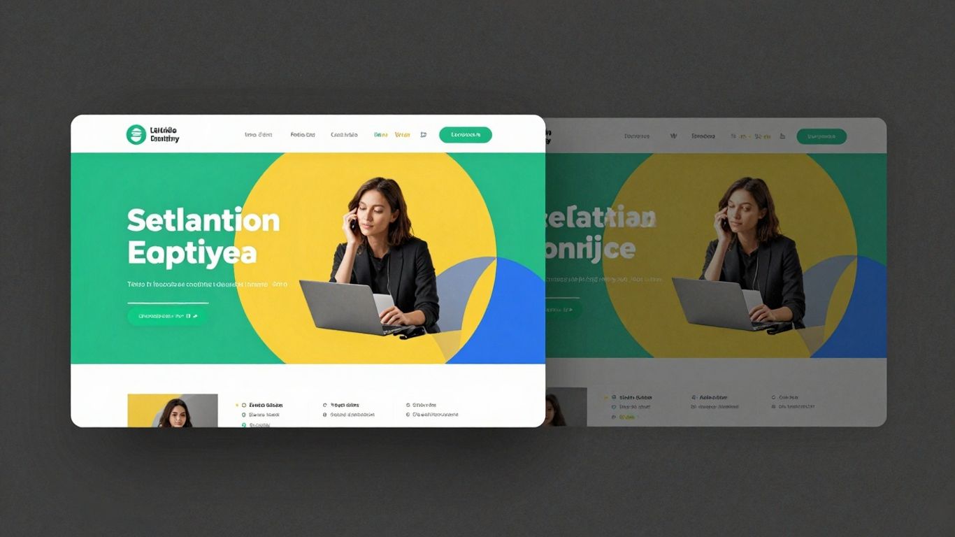
Right then, so you’ve put together a cracking landing page for your trades business. It looks good, it says all the right things, and you’re hoping it’ll bring in a flood of new leads. But how do you really know if it’s doing the best job it possibly can? That’s where A/B testing comes in. Think of it like this: you’ve got two versions of your landing page, say Version A and Version B. They might look almost identical, but maybe Version B has a slightly different headline, or the ‘Get a Quote’ button is a different colour. You then show Version A to half your visitors and Version B to the other half, completely at random. After a while, you look at the results. Which version got more people to fill out the form or pick up the phone?
This is how you move from guessing to knowing.
It’s not just about tweaking colours, though. You can test all sorts of things:
- Headlines: Does a question grab more attention than a statement?
- Call-to-Action (CTA) text: Is ‘Request a Free Quote’ better than ‘Get My Estimate’?
- Form length: Do fewer fields mean more submissions, even if the leads are less qualified initially?
- Images: Does a picture of your team at work perform better than a stock photo?
- Offers: Does a discount code bring in more enquiries than a free consultation?
Here’s a quick look at what you might test and the kind of results you could see:
| Element Tested | Version A | Version B | Conversion Rate Increase |
|---|---|---|---|
| Headline | ‘Reliable Plumbing Services’ | ‘Leaky Pipe? We Fix It Fast!’ | 12% |
| CTA Button Colour | Blue | Green | 5% |
| Form Fields | 5 Fields | 3 Fields | 18% |
It might seem like small changes, but these can add up. For instance, if your page usually gets 100 leads a month, a 10% increase means an extra 10 leads just from that one tweak. Over time, these small wins can make a big difference to your business.
You’re essentially running little experiments on your own website. The goal is to find out what your potential customers respond to best. It takes a bit of patience, and you need to let the tests run long enough to get reliable data, but the insights you gain are incredibly useful for making your landing pages work harder for you. Don’t just set it and forget it; keep testing and refining.
Tools like Google Optimise (though it’s being retired soon, so keep an eye on alternatives), VWO, or even built-in features on some landing page builders can help you set these tests up without needing to be a coding wizard. The key is to test one thing at a time so you know exactly what change led to the improvement – or lack thereof.
Conclusion: Investing in Landing Page Design for Trade Business Growth
So, we’ve gone through all the bits and pieces that make a landing page work for trades businesses. It’s not just about having a website; it’s about having specific pages designed to turn interest into actual business. Getting this right means you’re actively attracting clients with effective landing pages, rather than just hoping they stumble across you.
Think about it: a well-designed landing page acts like your best salesperson, working around the clock. It’s there to make a promise and then deliver on it, guiding potential customers smoothly towards getting a quote or booking a service. This focused approach is what separates a good website from one that genuinely generates leads. It’s a smart way of attracting clients with web design that’s built for purpose.
Here’s a quick rundown of why this investment pays off:
- Clearer Communication: Visitors know exactly what you do and what they need to do next.
- Higher Quality Leads: People who fill out your form are usually more serious about needing your services.
- Better Return on Investment: You get more value from your marketing spend because fewer people leave without taking action.
- Improved Brand Perception: A professional, easy-to-use page makes your business look reliable and competent.
The difference between an average landing page and a high-converting one often comes down to the details. It’s about understanding what your potential customer is looking for and making it as easy as possible for them to find it and take the next step. This isn’t just about aesthetics; it’s about user experience and clear communication.
Ultimately, dedicating time and resources to your landing page design isn’t an expense; it’s a strategic move. It’s about building a more efficient system for bringing in new work and growing your trade business. Making these pages work harder for you is a direct path to more bookings and a stronger business overall. Remember, a landing page is crucial for effective lead generation, so don’t underestimate its power.
So, to wrap things up, putting money into making your trade business’s website look good is a smart move for growth. A great landing page can really make a difference. Ready to see how a fantastic landing page can help your business? Visit our website today to learn more!
Wrapping Up: Your Landing Page is Your Digital Shopfront
So, there you have it. Getting your landing page right isn’t just about making it look pretty; it’s about making it work hard for your trade business. A well-designed page that’s clear, focused, and easy to use can make a massive difference in bringing in new customers. Think of it as your virtual shop window – if it’s messy or confusing, people will just walk on by. By paying attention to the details, like a clear headline, a simple form, and a strong call to action, you’re essentially rolling out the welcome mat for potential clients. It really does come down to making it as easy as possible for someone to take that next step, whether that’s booking a quote or asking for more info. Get this right, and you’ll see more leads walking through your digital door.
Frequently Asked Questions
What exactly is a landing page for trades businesses?
Think of a landing page as a special page on your website. It’s designed to get people to do one specific thing, like asking for a quote or booking a service. It’s not like your main homepage with lots of different links; it’s focused on getting you new customers.
Why is the design of a landing page so important?
The way a landing page looks and feels really matters! If it’s messy or confusing, people won’t stick around. A good design makes it easy for visitors to understand what you offer and encourages them to take the next step, like filling out a form.
What makes a landing page 'effective' for getting leads?
An effective landing page has a clear headline that grabs attention, explains exactly what you do and why it’s good for the customer, uses nice pictures or videos, and has a clear button telling people what to do next. It also needs a simple form to collect their details.
Should my landing page look good on a phone?
Absolutely! Most people look at websites on their phones these days. If your landing page isn’t easy to use and read on a small screen, you’ll miss out on lots of potential customers. It needs to work perfectly on any device.
How can a landing page help me appear in local searches?
You can design landing pages specifically for the areas you serve. By using local keywords and mentioning your service areas, these pages help you show up when people in your town or neighbourhood search for services like yours online.
What's the point of testimonials or reviews on a landing page?
Testimonials and reviews are like a big thumbs-up from happy customers. They show new visitors that you’re trustworthy and do a great job. This makes people feel more confident about contacting you.
How many questions should I ask on the contact form?
Keep it simple! The fewer questions you ask, the more likely people are to fill out the form. Only ask for the essential information you need to get in touch or provide a quote. Too many questions can scare people away.
What is A/B testing for landing pages?
A/B testing means creating two versions of your landing page, with just one small difference (like a different button colour or headline). You then show each version to different visitors to see which one works better at getting leads. It’s a way to find out what truly works best.